A few days ago I visited the site one of my favourite blogs as far as packaging design is concerned, The DieLine, and I found a really interesting article by Grant Wenzlau. I thought it would be useful to do a little summary of the key points of the article. Let’s begin!
During the past decade, the sheer volume of messages, appeals and information a person is subjected to during the 24-hour day has been a persistent problem. There is not a moment, a conscious moment that is, when we are not being inundated with advertising or communicative messages. We find ourselves somewhat distracted, divided and overwhelmed. That is why we increasingly value those messages or adverts that impact us in a clear and different way, those that take the right and necessary amount of time and engage us and capture our interest.
Without a doubt, different is what stands out. Brands know this so they go about establishing new trends which they govern with this principle in mind. It is then, after tirelessly working on it, the trend and what made it different goes back to being ordinary and becomes the norm again. A never-ending circle.
And what is the new trend in the current circle? Essentialism.
Whilst minimalism comes under the saying “less is more,” essentialism says “sufficient”. It focuses on the essential, on the clarity of the message and the creation of an emotional link with the audience. In this way, designers are not only designers, but creators of experiences connecting the product with the brand.
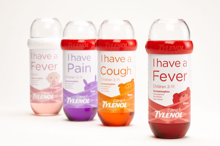
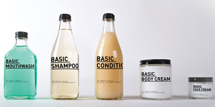
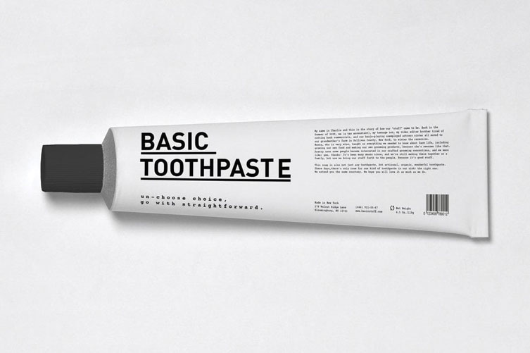
ASAP – As simple as possbile
Designs based on the premise of quick recognition, one quick glance and you know what they are for. They don’t simplify, they clarify.
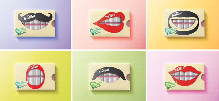
GEOMETRY 101
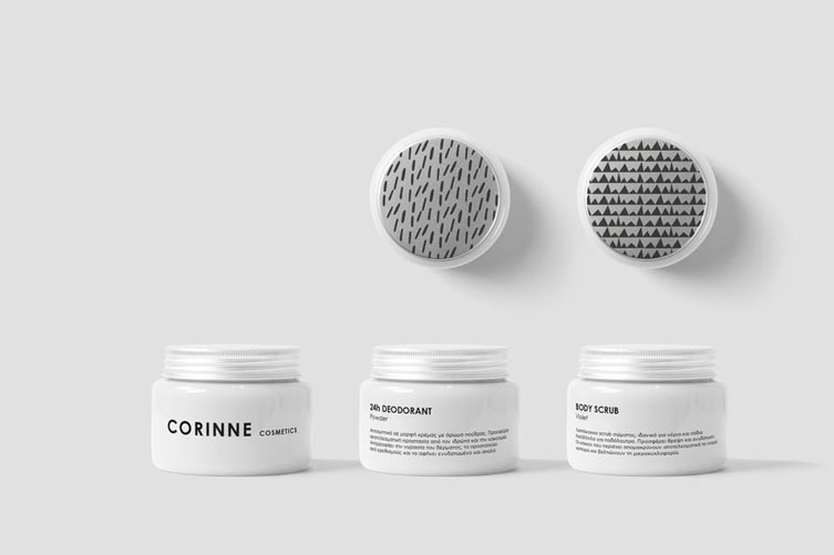
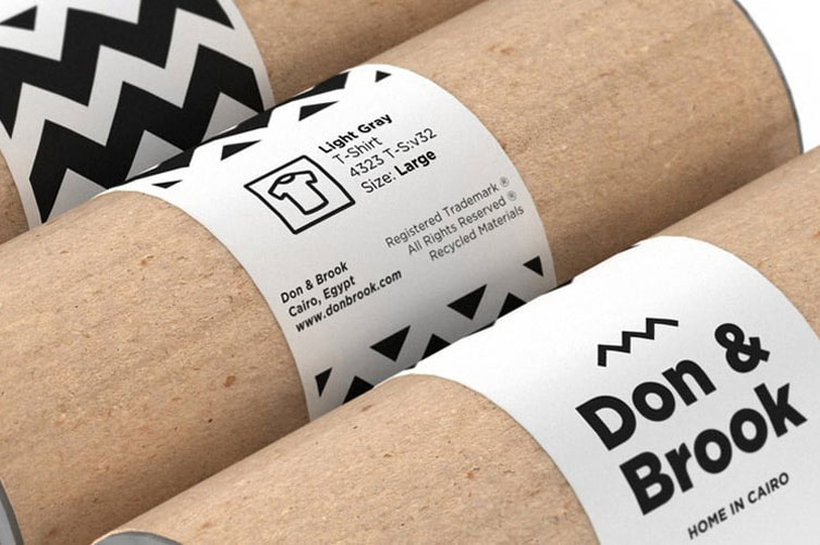
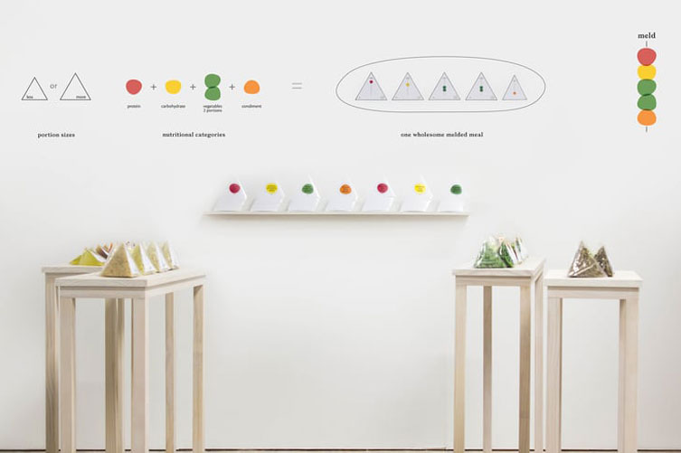
The design is centred on conveying simplicity, closeness and honestly through patterns and shapes. For example, using the most basic shapes (circles, triangles, squares), or either monochromatic or greatly contrasted colour palettes. Black and white.

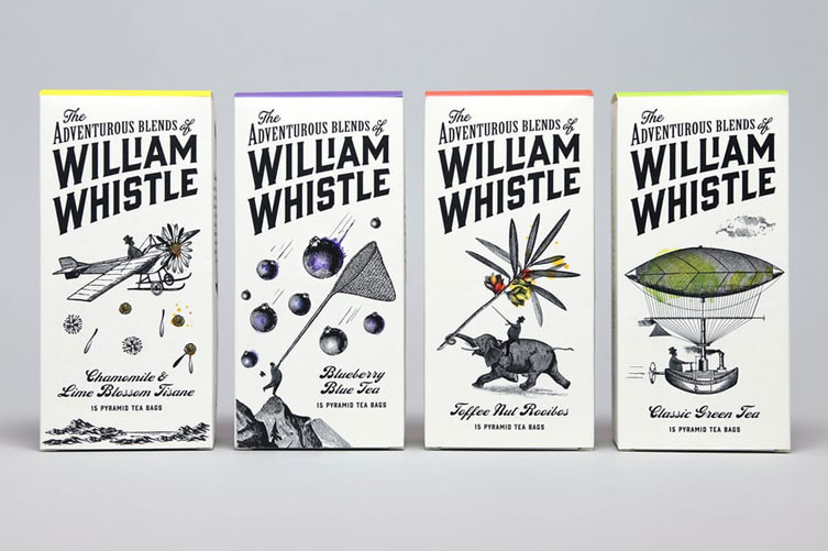
OLD-FASHIONED ADORNMENTS
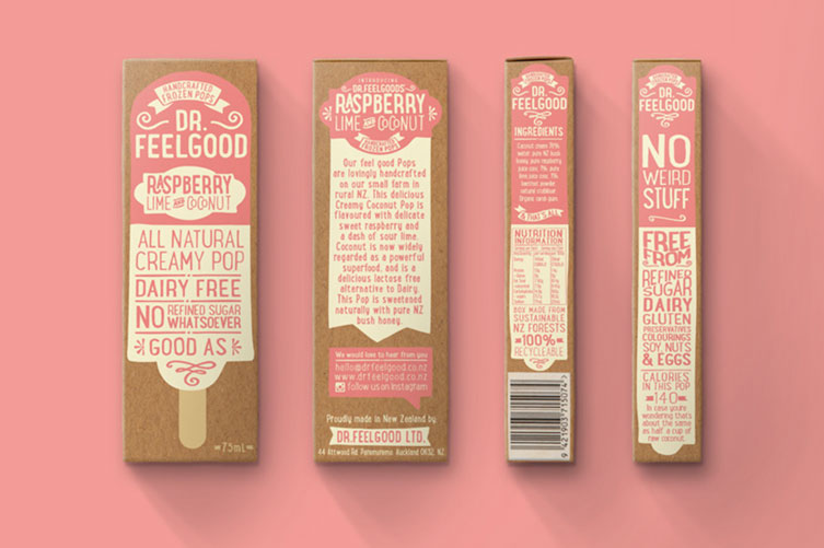
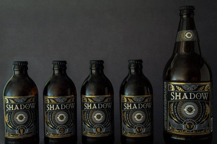
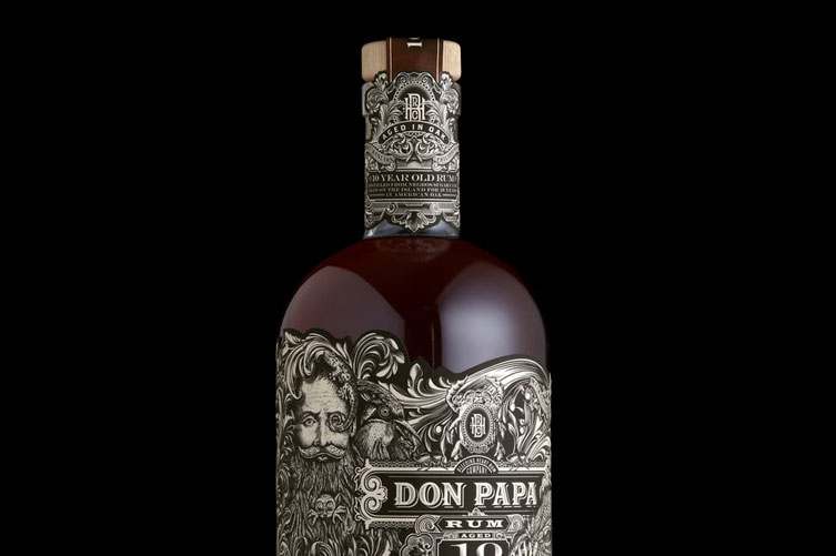
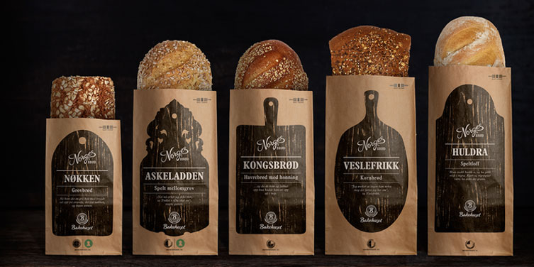
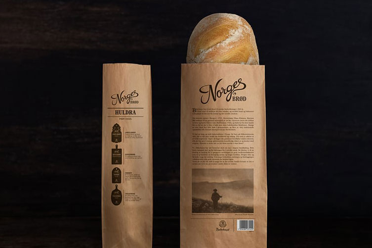
Designs based on the idealisation of the past, yearning for simpler times, pointed towards the detailed and the crafted. Nevertheless, it is a design which has been readapted, using old shapes yet creating a juxtaposition with other eras. For example, using an ornamental pattern with a modern font.
JEWELS
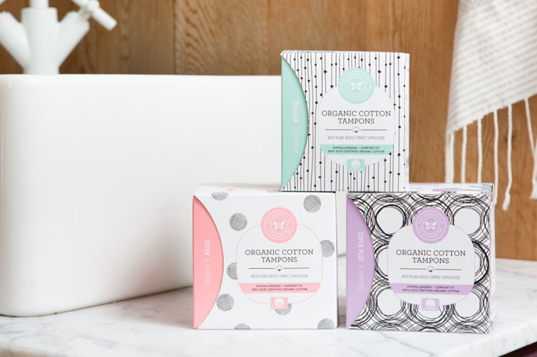
Another design trend is the creation of products that wish to be on show, displayed on our shelves at home. However not for the brand, but for the design.
Products that we previously tried to keep hidden in the cupboards of the bathroom or kitchen, but that we are now proud to leave for all eyes to see. This captures the attention of everybody, exhibits the products for more people to see and generates new potential clients.
