Organic products are becoming increasingly present in our lives. Whether they are here because they are in fashion or because they are a logical solution to environmentally harmful waste, the fact is they are here, and it seems it’s only the beginning.
At our design agency, Garrofé, we are receiving more and more requests to develop organic packaging so we have decided to put together this guide on ‘How to develop organic packaging.’
COLOURS
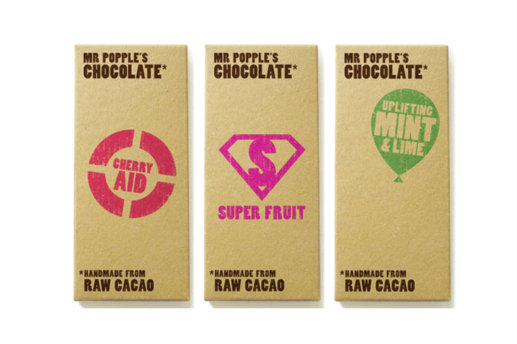
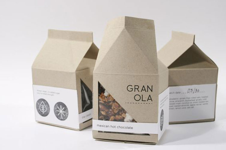
To quickly identify an organic product, you can usually notice a predominant colour, such as brown, combined with greens, light blue and deep purple. The use of asetic/white backgrounds or mixing bright colours is not recommended.
FORMAT
Break free from the norm. Usually done in crystal or bamboo, depending on the type of product.
RESOURCES
Using a certain type of paper or texture can create the natural look you are going for. Wavy card, Kraft or recycled paper accentuates this look.
FONTS
They have to ooze a sense of artisanal craft, as if they were written by hand. For this, a good option is calligraphic/handwritten fonts or retro fonts, if you want to make the writing stand out more.
ILLUSTRATIONS
At this point, adding a graphic element can give the product a first class organic slant. The effect can be achieved with soft illustrations, such as watercolours, without having too busy of a background.
FINISHING TOUCH/PRINTING
A good option is to use earthy coloured stickers that mix in with the white. This will give the product a more apothecary themed look, handmade for you. Another option is screen-printing it directly on to the glass.
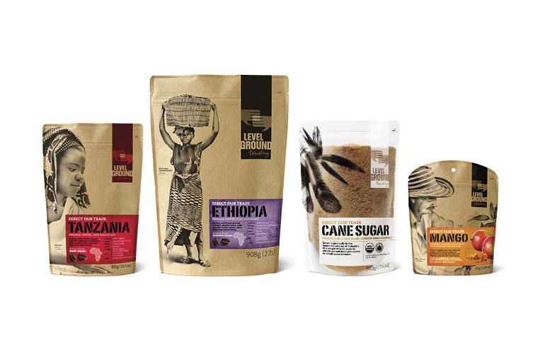
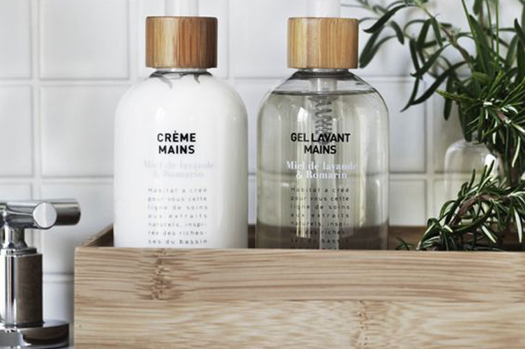
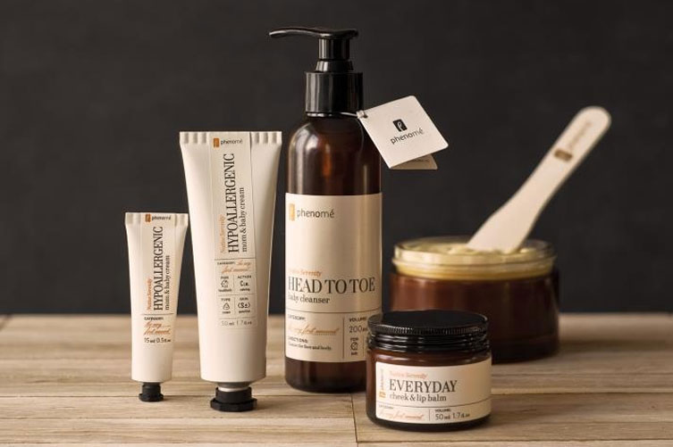
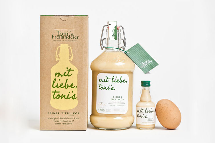
We’ll leave you with some examples:
2 Responses to ORGANIC PACKAGING